
By the looks of my last post, it’s been a while. In the short space of the past month, I cleaned the house for Passover, cooked ten feasts, (I’m not kidding. I counted. Ten.) turned the living room into a bedroom for my frail father, pushed him and his wheelchair through Six Flags, and hosted untold numbers of children who trooped through the house in search of Passover food that wasn’t tasteless paste made entirely of matzah meal. Daffodils pushed their heads up through the New Jersey permafrost. Spring has sprung.
Also, I worked on my book cover.
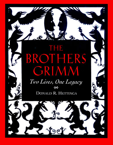
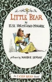
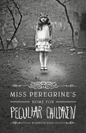
And as I worked, I was thinking of the illustrations of the great and tragic Bruno Schulz. I was thinking of Diana Bryant, who was my teacher at Parsons, and her papercuts. I was thinking about Maurice Sendak, and his evocative, elegiac pen and ink drawings for the Little Bear books. And for some reason, the wonderful and eerie cover of Miss Peregrine’s Home for Peculiar Children, by Ransom Riggs.

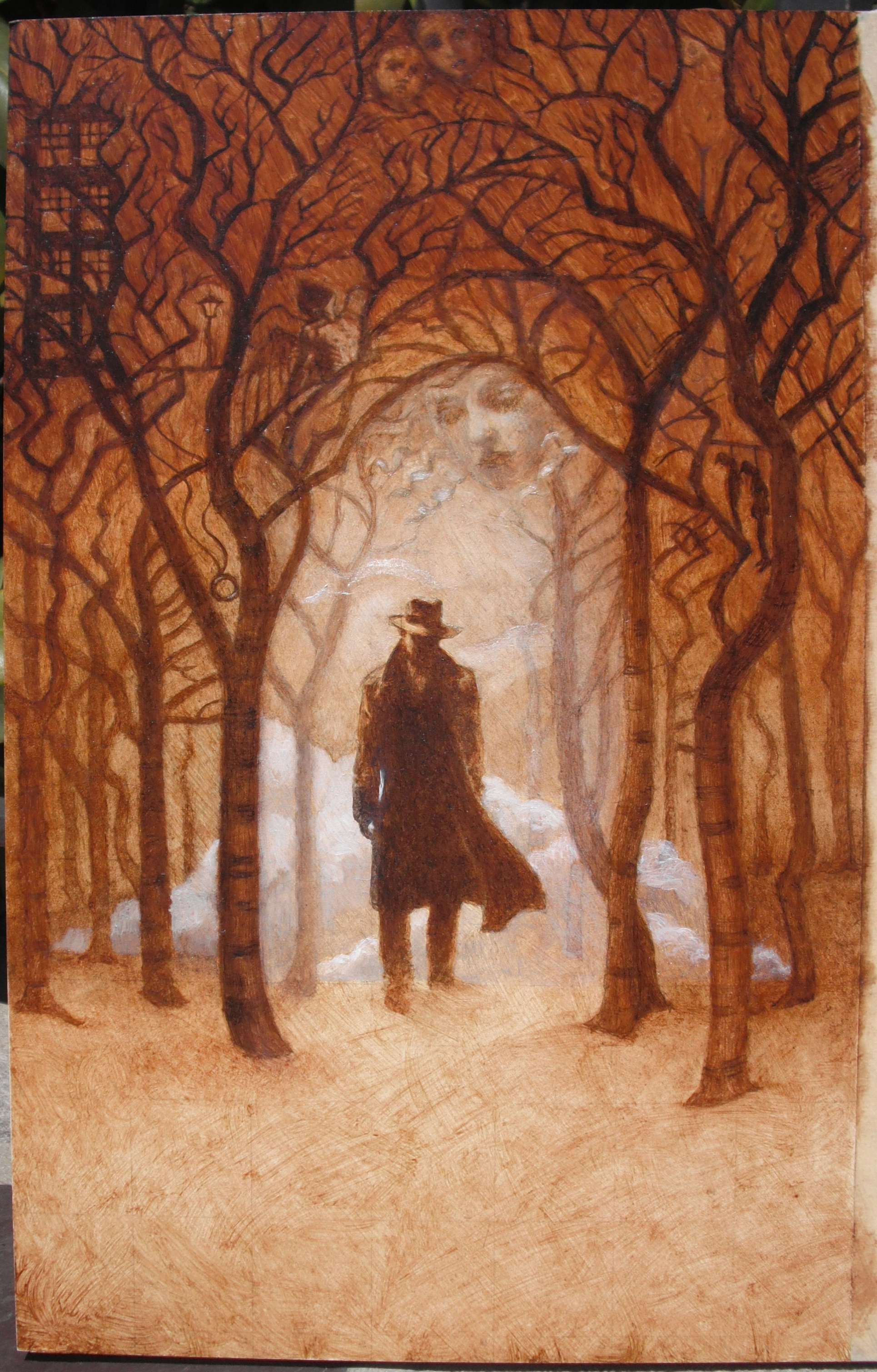
The moment the holiday was over, matzah and matzah products cleared away, kids back to school, I spent an entire day painting. I mean, an entire day. Sat down after I got the kids on the bus, got up long after they went to sleep. Here is how my cover illustration turned out:
Bleary-eyed, I posted it on Facebook, sent it off to my agents, and toppled into bed.
The following morning, I glanced at Facebook, and basked in the gratifyingly rave reviews. After an appropriate amount of time basking, I drank a few gallons of coffee. Then I opened up an email from my agents.
They have played with it a bit in the office, toned down the color. They want me to try working with their version. Something about the silvery color, the play of light and dark suggests moonlight, works better than brown.
My first, knee-jerk response was, “Oh, no.” As a classically-trained artist, I love my little underpainting, rendered in rich, classical browns. But then the designer in me clears her throat and speaks up.
Look, she whispers. This is undeniably haunting. Especially when reduced to the size it will be viewed on Amazon. And, the little designer continues whispering, this will be easier to run type across.
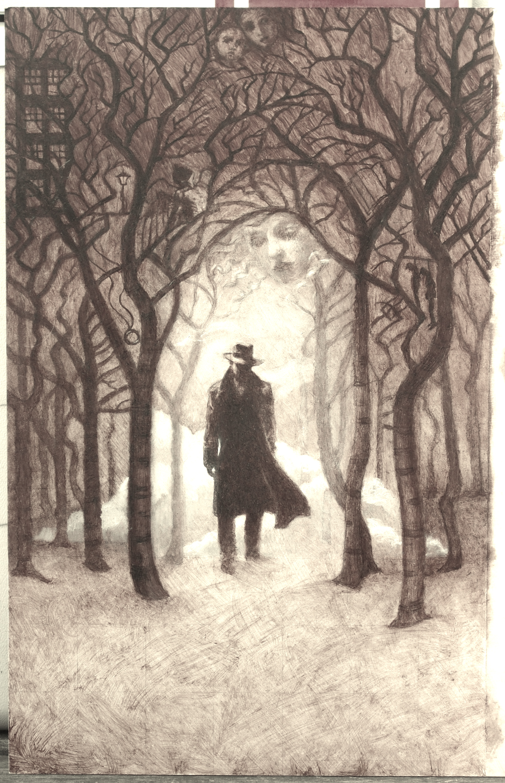
In my heart of hearts, the little painter knows that the little designer is right.
So, the very next thing I did was download my Free 30-Day Trial of Photoshop. (Thank you, nice sales people at Adobe!)
That was last Thursday.
It has been a long time since I used Photoshop in any professional way. In recent years, mostly I just used it to sharpen photos for my portrait paintings. Things sure have changed a lot. The learning curve is high. I realize just how long a word “Underpainting” really is. Should I break it into two lines? Should I do “Under” in regular type, and “painting” in bold? Hours go by. Days. Now I think it looks misspelled. I wonder if it’s too late to change the title.
And then I find the “New Adjustment Layers” menu.
Oh, Photoshop. How I love you. Look at this cool stuff you can do with type! I can drop a shadow in from any angle, or make the letters look embossed, or chiseled, or shiny. I can make letters transparent. I can turn the whole thing blue. What day is this, anyway? When’s the last time I washed my hair? Nothing matters. Nothing matters but precious, precious Photoshop…
And then I find the warp button.
Jackpot!
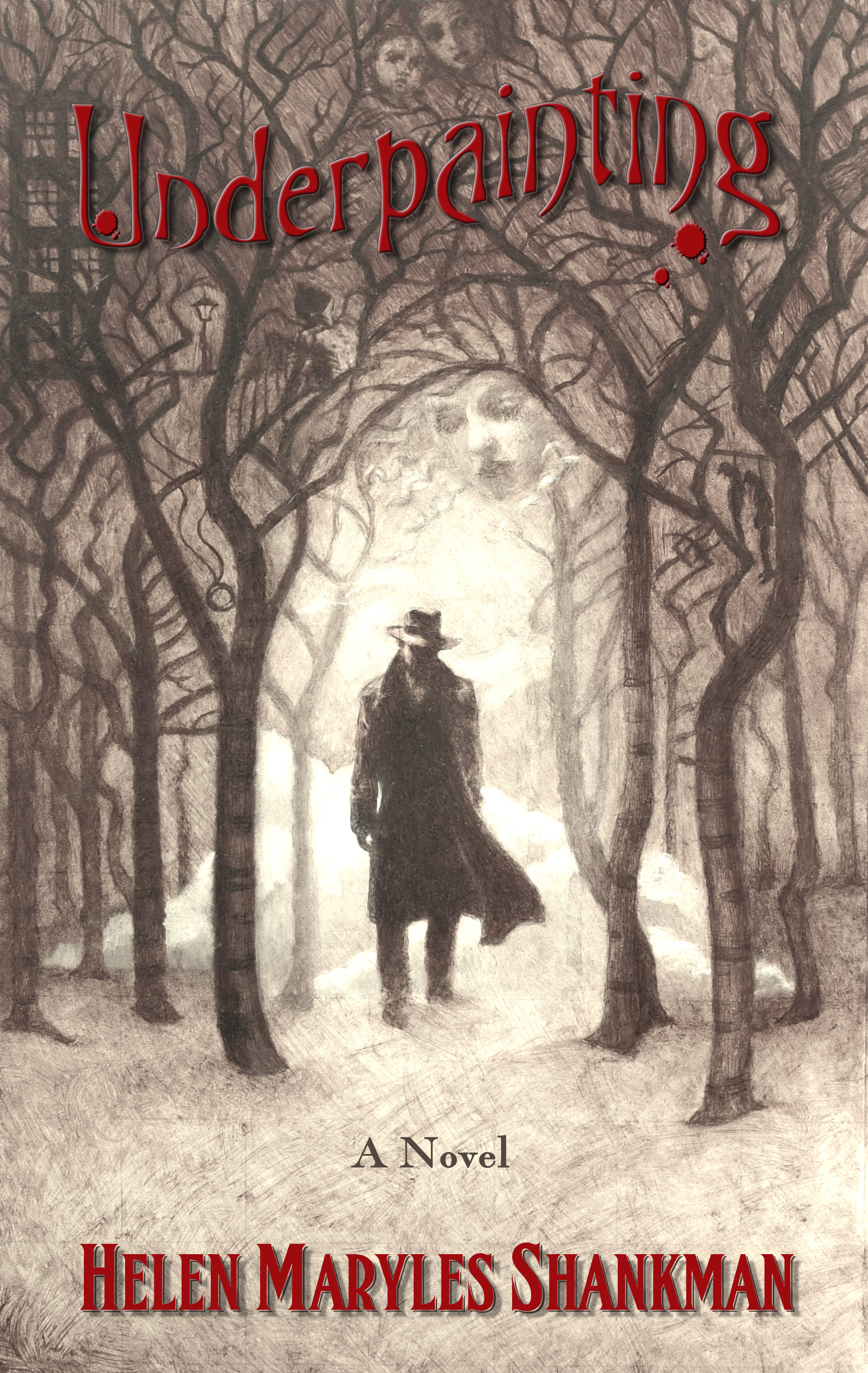
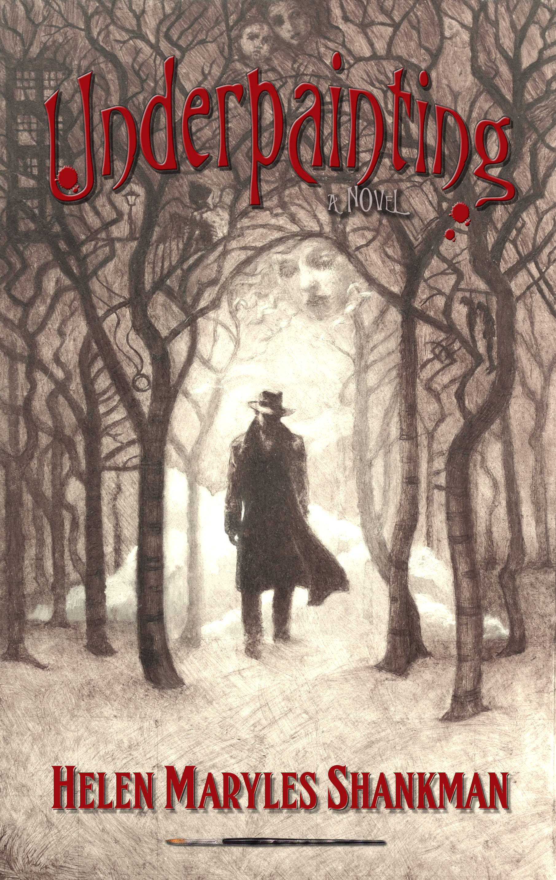
Now I have two versions I love, and I can’t decide which I like better.
What do you think?

Since you asked… I like the larger title but I like “A Novel” and your name on the first version.
Thanks, Jan! You’re the second person who told me that. I think I like those, too.
I like the top one, it haunting.
Great job.
Thank you, Zohar! Seriously, I can’t decide. I’m waiting to hear which ones my agents like best. Hoping to be finished with it soon!
How did I miss this post?(though I did see the cover on FB.) I love seeing your process, Helen! The original brown-toned one was beautiful, but the silvery tones are great with the red type. I like the larger type for the title and agree with Jan that the plainer font “A Novel” above your name works nicely. But they are really both stunning. I am eager to read the book!
Thank you for your Iza! I’m leaning toward the one with larger type, too. My biggest concern is that the red is too dark. I just got back from looking at books in Barnes and Noble…and I think I’ll try a lighter red.